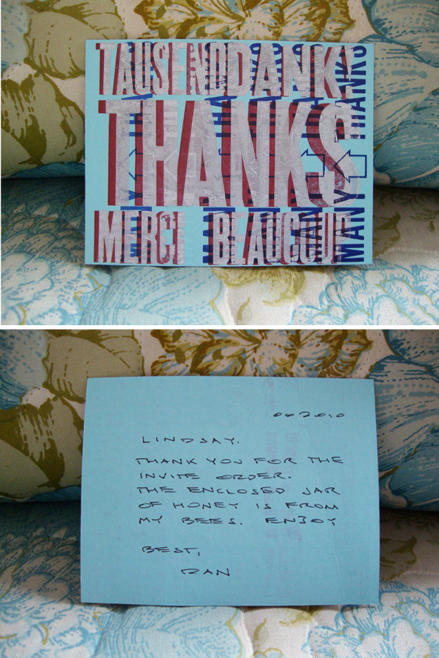
What a little gem did I find in Flywheel Letterpress! {Actually, the amazing Corbyn Tyson found it, and then was generous enough to share with me}. I’ve done several jobs with them, and let me tell you… wow. Just when you begin to wonder when the “service” part fell off of the word “customer,” Dan Barron and Flywheel Letterpress come along and completely restore your hope. When I received the invites they printed for me for Haylee & Anthony’s wedding {post to come}, here’s the note I received with the package:
HOW CUTE IS THAT?! And the organic honey he sent me {from another project of his, Bee Wise Honey in Freeport} was deeliscious. Honey and a personalized note. Is there much more to say? Surely. From the prompt replies to the perfect, exact, cropping {I’m a bit of a stickler about this… I mean, if I spent the better half of an hour pushing pixels to get the margins and grids of my design juuuuust right, then I would prefer that whoever is doing me the service of cutting my jobs pay the same kind of attention to detail} … Flywheel is the way. to. go. Thanks, Dan! Keep up the great work. I’ll be back!
Fun fact: Flywheel also printed a few runs of the world-famous Field Notes journals. Check out this film about Flywheel Letterpress & the Raven’s Wing run of Field Notes by Coudal Partners. {Click here for a more extensive list of the film credits and to learn more about the creative studio that is Coudal Partners}.
OH YES! While we’re on the subject of honey {even though we’re not anymore}…
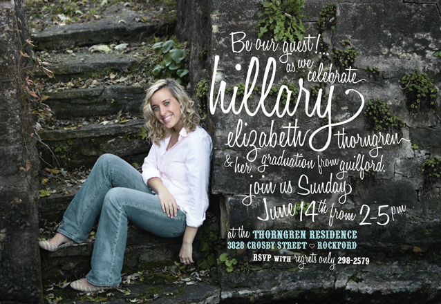
One of my favorite fun script typefaces is Honey Script. Below is an invitation I designed a while ago for sweet Hilary’s graduation so you can see it used in an application. It’s got a swingy, retro-y feel that makes me happy. Try it for yourself! You can download it from DaFont by clicking on the link above. Enjoy! xx, linds
Tip: When I use an actual script font instead of making my own, I always try to finish the ends of the important words to make it extra special. Meaning, for instance, in a pre-designed script typeface, a y doesn’t really have a swirly tail because it’s designed for another letter to be able to come after it. So, when it falls on the end of the word, I always try to draw a prettier end on it to look like how handwriting would look more naturally, instead of an abrupt ending.
.jpg)
.jpg)
.png)


.png)
.jpg)
.jpg)


